Learn to transform your team's data into actionable insights with monday.com's reporting tools. This guide covers dashboard creation for single and multiple boards.
Planning your report
Before building your dashboard, answer these key questions:
- Who needs this report? – Individual, team, or leadership
- What metrics matter most? – Progress, budgets, timelines
- Where will data come from? – Which boards/columns
- What time period matters? – Weekly, quarterly, or project-length
- Why create this report? – Identify bottlenecks, improve planning, etc.
Setting up your board for reporting
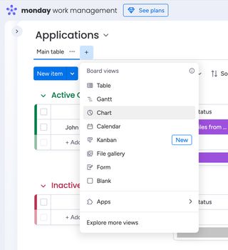
For single-board dashboards:
- Click the + button next to your board view
- Select Chart or Blank to add a dashboard
- Rename your dashboard (e.g., "Project Overview")
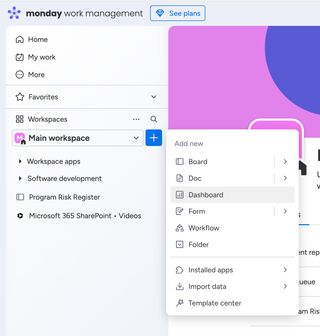
For multi-board dashboards:
- Click + Add under your workspace name
- Choose New Dashboard
- Select all relevant boards
Essential reporting widgets
| Widget | Best For | Configuration Tips |
|---|---|---|
| Battery | Task completion status | Link to your status column |
| Chart | Comparing metrics over time | Set X/Y axes based on needs |
| Gantt | Project timelines & dependencies | Connect to timeline/due date cols |
| Time Tracking | Monitoring hours spent on tasks | Add automation to start/stop time |
| Workload | Team capacity planning | Connect to people + hours columns |
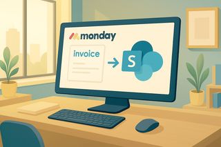
| Secure Excel Cell* | Displaying data from spreadsheets hosted on Microsoft 365 | Add whatever external data you need to see in monday.com |
| Secure Excel Chart* | Embedding Excel charts from Microsoft 365 | Display external charts and graphs from Microsoft 365 |
| Tableau Cloud | Displaying your Tableau BI data in monday.com | Link to any external data |
* The Secure Excel Cell & Secure Excel Chart widgets are part of the Microsoft 365 SharePoint • Embed & Automate app
Building a project progress dashboard
Add progress tracking
- Insert a Battery widget connected to your status column
- Rename it "Project Completion"
Visualise tasks by phase
- Add a Chart widget
- Set X-axis to "Groups" (phases)
- Set Y-axis to "Count items"
Track budgets
- Add three Numbers widgets for:
- Planned budget (sum)
- Actual spend (sum)
- Variance (formula column)
- Add three Numbers widgets for:
Enhance your workflows with David Simpson Apps
Discover powerful apps and integrations for monday.com, Atlassian, and Microsoft 365. Streamline processes, embed analytics, and boost collaboration.
Explore appsCreating cross-team comparison reports
- Ensure consistent board structures across teams/locations
- Add comparison charts:
- Stacked bar charts to show volume by team
- Line graphs for SLA compliance tracking
- Filter data by board when needed (via widget settings)
Pro tips for effective reports
- Use conditional formatting to highlight critical metrics
- Duplicate widgets for different data segments instead of overcrowding
- Set thresholds in time/workload widgets for visual alerts
- Leverage formulas to calculate custom metrics like SLA compliance
Maintaining your dashboards
- Review widget relevance quarterly
- Archive obsolete reports to reduce clutter
- Share dashboards with stakeholders via secure links
By following this structured approach, you'll create dynamic reports that drive better decisions and team performance.
Next Steps
→ Explore David Simpson Apps' products for monday.com dashboards
→ View the reporting in monday.com webinar series
→ Explore monday.com's template center for dashboard examples